


Kami no Mistake ?!
One last junk before taking some vacation.
Hayate no Gotoku got a new OP. But let’s not forget how nice the previous one was. Especially this part that I was never bored of :
I’ve come to think recently that Izumi is the one for Hayate, but some Red x Blue is always welcome.
And now, omake time~


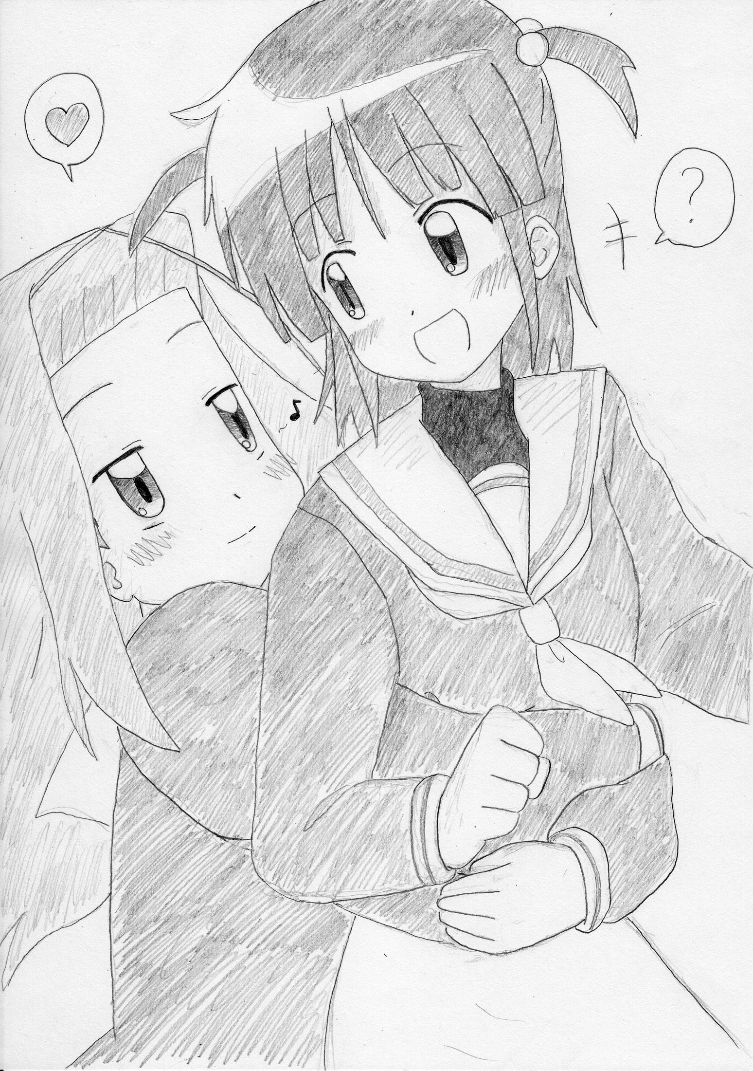
Again, made some quick portrait-ish junks before getting started. Well, thanks to that I could notice that Izumi looks more “Izumi-like” when her iris and upper ‘eyelid’ aren’t connected, unlike here.

Accidentally put contrast to max, and I thought that it actually looked kind of nice like this… but that’s probably just me XD
===
As for the new OP…
I like the song of the previous OP better. Moreover, the new song gets too much effects and sounds like it’s being sung by a chipmunk. ^^;
But anyway, what’s more important is that this new OP is win for being full of intense MOE~.
Few pics from it :


Left : <3 <3 <3
Right : XD
Hina and Ayu appear a lot in this new OP, definitly giving the feeling that they are the true main heroines of the show.

NUOOOO !
This show is awesomely DFC.

NUOOOOOOOO !!!
I liked how this part is animated, and Miki’s ‘sexy’ pose. XD

NUOOOOOOOOOOOOOOOOOOOOOOOOOOOOOOO !!!!!!!!!!!
My fav part from the new OP. XD
Saku <3 <3 <3

A-

MA-

ZING !
Hina <3 <3 <3 <3 <3 <3 <3 <3 <3 <3
Dunno if I’ll be able to post anything during vacation, so see ya in september~
:beer:
“Accidentally put contrast to max, and I thought that it actually looked kind of nice like this… but that’s probably just me XD”
J’aime bien le rendu aussi ! :o
Vraiment sympa.